SKETCHBOOK
SKETCHBOOK
SKETCHBOOK


UX DASHBOARDS
Biomotivate Internship
UX Design & Data Visualization | May 2021 - September 2021
UX Design Team
-
Designed and prototyped staff dashboards and user interfaces for staff at Opioid Addiction treatment centers using patient biometric data, allowing them to clearly analyze trends in patient's behavior
-
A/B tested prototypes with staff at centers around the region to get feedback and develop 30+ iterations
Data Visualization Team
-
Worked on developing the functional dashboard to display and parse patient tech wearable data using JavaScript D3, HTML, CSS to improve the current method of information organization at many treatment centers
Solo Patient Journey Map Project
-
Created workflows and a comprehensive patient journey map for a National Institute on Drug Abuse competition based on interviews
-
Won second place, awarded $30,000 and publication on the national website
Tools
Skills
.png)
UX DESIGN TEAM
Staff Dashboard Redesign & Development
3 Month Project | Figma Prototyping, Illustrator
Primary Problem
Opioid addiction treatment center staff often struggle to organize and manually analyze paper trials of untabulated patient data. Unorganized information makes it difficult to analyze critical trends in biometric data collected from wearable devices and identify potential risks in patient behavior. More effective communication between staff and patients can contribute to preventing relapses in treatment centers.
Solution
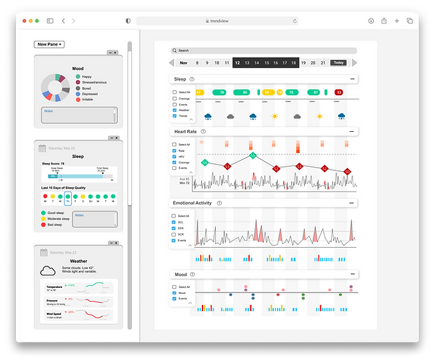
As a part of the UX Design team, I designed and prototyped dashboards and user interfaces that summarize patient biometric data (sleep cycles, heart rate (HRV), emotional activity (EDA), mood logs, events), helping staff in treatment centers better identify high-risk patients. I developed 30+ iterations of staff dashboard redesigns consolidating patient information into 4 different pages: Trendview weekly, Trendview Daily, Card View, Snapshot View, each fulfilling different staff needs.
Secondary Problem
After A/B testing functional prototypes with Opioid addiction treatment centers in Ohio and Pittsburgh, in addition to a series of presentations for an AIM research grant, I was able to develop more effective iterations from feedback.
Several professionals mentioned that too much information was displayed on the interface; the page was too dense and cluttered which made it difficult to comprehend necessary details.
Design Process
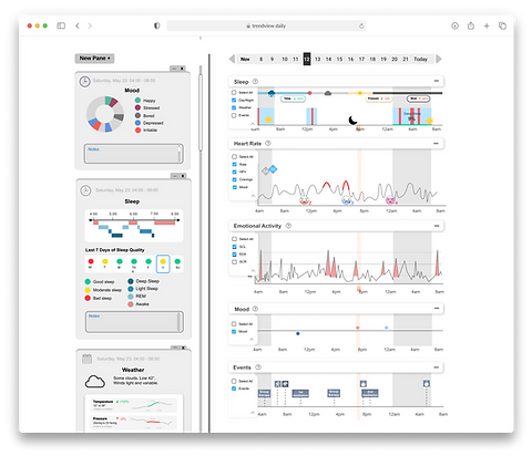
Trendview Daily & Weekly Pages
-
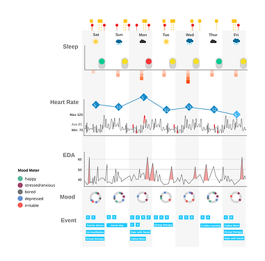
2 Pages: Displays patients' weekly and daily biometric data for multiple measures (EDA, Heart Rate, Mood,
Sleep, Events, Cravings, HRV, Weather) -
Process: Developed 20+ iterations consolidating patient information and user tested with Opioid Addiction Treatment Center Staff.
-
Target audience: Staff at treatment centers
-
Key Insight: After A/B Testing the original iteration with staff, the main key insight was that too much information is displayed on the interface; the page was too dense and cluttered which made it difficult to comprehend necessary details to identify trends in patient behavior or find necessary data quickly.
Original Trendview Daily Design

Original Trendview Weekly Design
.png)
Overall Redesign Decisions
.png)
Integration of Search Bar
Staff are able to filter to include certain events or date ranges to locate symptoms and identify trends
Integration of a Date Adjuster
Added a scrolling week adjuster menu to indicate the data subset being analyzed. This makes it easier to distinguish weekly from daily trend view and navigate through dates to recognize patterns in patient behavior over time. Staff noted that most trends are visible by comparing week-to-week data. The "today" button eases access to current week's information.
Minimizing Bar Design
Staff do not need all of the data to be visible at once; it’s more effective to only see the information needed at a time, preventing information overload and confusion. This minimizing tab design still allows for data points to be compared across different biometric spectrums.
Added Info Buttons
Some people are unfamiliar with biometric measurements, and the tooltip can also logistically explain how the measurement is taken (including frequency).
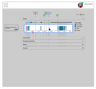
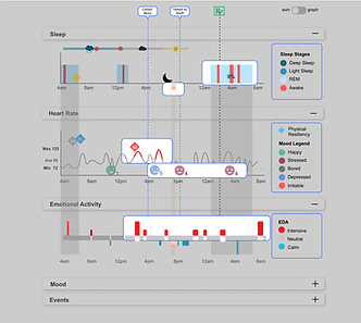
Sleep Panel Redesign
Old Trendview Daily
.png)
Old Trendview Weekly

Sleep Panel
Incorporated simple colors to easily indicate positive or negative sleep, and created iterations that include sleep scores derived from the wearable device to quantitively access sleep quality. Removed the toggles since they had no toggle function. The daily view shows a simplified version of sleep stages.
Option Bars with Toggles
Option to add specific components to each graph rather than have them always visible, making the graphs easier to read
New Trendview Daily

New Trendview Weekly
.png)
Weather Trends
Many staff members mentioned weather can often influence emotions and mood so I decided to incorporate weather trends more clearly in the two views. The daily view shows more detail with also displaying trends in temperature and pressure.
Events Overlapping
Old versions included events running through the dashboard blocking biometric measures. I moved this into the events option dropdown so it is not always visible.
HR, EDA, Mood Panels Redesign
Old Trendview Daily
.png)
Old Trendview Weekly
.png)
New Trendview Daily

New Trendview Weekly

HRV Diamonds
Mood Circles
Events
Changed colors to green and read to clearly indicate positive and negative above the threshold.
Added events as a toggleable option for each section, removing lines going through the sections. Biometrics throughout the day are often a result of events such a "therapy," or "meeting family."
Added circles to represent positive and negative moods instead of having faces. Removed small mood circles since the majority of the day is not reported moods.
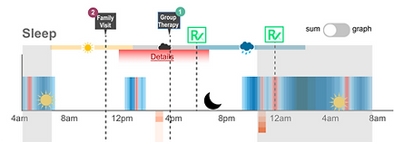
New Details Panes Concept
Designed a new feature for the dashboard where staff can click on a specific day in weekly view to see details for that day in any chosen measurement. They can also click on a time range in daily view to see details for that time window.
-
This allows for detailed information about the measurements to still be visible and easily accessed by staff but not overwhelming at first sight in the main interface section.
-
The feature also allows for the addition of more panes, to compare measurements across days and recognize patterns across measurements (etc. event of “group therapy” consistently decreases heart rate).
.png)
Sleep (day/ specific time range)
Includes sleep quality for the past 10 days/ 7 days to quickly compare trends over time. Also includes more detail breaking down a certain period of sleep into different stages with REM, Deep, Light, and Awake
Weather
Specific details for that day including temperature, pressure and wind speed. Weather can often influence emotional responses
Mood
Records the moods logged on the patient’s app
Also includes a notes section for staff members to record irregularities or for patients to write mood descriptions/ explanations
Filtering & Storytelling Exploration
Exploration on how to narrow down and display filtered search results according to specific word queries and date ranges through vertical zoomable filters and highlighting certain sections without a gray overlay

.png)
Final Prototypes
Trendview Weekly Page
Left: Minimizing Design with all tabs expanded (most complex view)
Right: Minimizing Design Simplified View (only one tab is expanded with no added filters)

.png)
Minimizing Tab Figma Prototype
Detail Pane Concept Figma Prototype
Trendview Daily Page
.png)
.png)
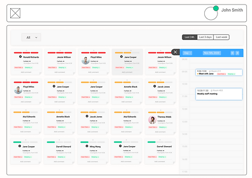
Final Card View
Final Snapshot View
Overview where every patient is summarized in one card; Can drag and organize cards in different orders; Color at the top of each card indicates risk level; Card can be expanded for more details or dragged onto a calendar
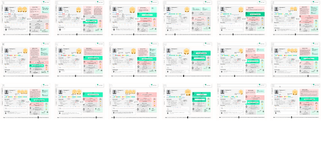
.png)
In order to receive feedback from professionals at treatment centers as a part of the AIM national grant research study, I created 18 snapshot view dashboards based on research from real patient participants in our study from the ** Treatment center. These dashboards reflect each patient's sleep, heart rate, emotional activity, and mood logs as well as convey the patient's history and notes from interviews, consolidating information for the staff to perform appropriate actions. I created 3 dashboards for each patient over a month in time. It also includes a section where significant logs are reported.
(🔒 Mockups details are hidden due to patient's confidential info )
.png)
Reflection
Through this experience, I learned how to effectively display and condense information by implementing new design features, ensuring users aren't overwhelmed at first glance. I began with breaking down the interface to analyze which components were the most critical and finding ways to organize the information architecture in a simplistic manner for each of the biometric measures. User testing the prototypes with actual staff members also allowed me to gain insight on the use cases and scenarios for the dashboard, knowing what information to prioritize. Working on the data visualization team also allowed me to understand how Figma prototyping coalesces with front-end development to develop a functional prototype for users. Data scrubbing data points from thousands of measurements from tech wearables allowed me to explore how to display data to make it appear more digestable and easily analyzed by staff.
Final feedback from staff at treatment centers unanimously mentioned how useful this dashboard would be, solving analyzing stacks of paper for each patient, allowing them to better treat those who face substance use disorder. This internship allowed me to understand the importance of understanding your target audience and their needs, and it was extremely rewarding to design something that would actually improve their quality of life if implemented.
Functional Dashboard Components
3 Month Project | Javascript, HTML, CSS, Figma
DATA VISUALIZATION TEAM
Problem Space
How can we visualize the biometric data recieved from wearables from patients into creating a functional prototype of the staff dashboard designed on Figma in order to take the product to market with implementations in Opioid treatment centers.
Project Overview
As a part of the Data Visualization team, collaborating with one other intern, I began to convert my Figma designs for the dashboard into Javascript through the D3 library and HTML and CSS. Below are components of the dashboard I began coding. They include different data visualizations of biometric data from patients' wearable devices. Data scrubbing and cleansing to determine critical data points from hundreds of thousands of measurements was also necessary.
Coded Components & Visualizations
Mood Visualizations
Analyzed 15 patient's anonymized mood log data over 1 week, separated by colors and positive and negative moods along the x axis
Events Timeline
Drawing from daily notes and logs, organized each patient's events over a month; the vertical timeline is scrollable and can be hovered over to see event details (i.g meal contents). This can be implemented for the events component of the details pane.
Emotional Activity Expandable Timeline
Zoomable graph of emotional activity data for one day, cleansed to include 1 data point per second, 86400 points recorded per patient. This functionality is what we hope to achieve for the graphs in the dashboard.
Monthly Sleep Chart
Displayed a patient's sleep data from their wearable over one month, with set thresholds for sleep levels with color changes and bar height to indicate sleep quality and length.
Patient Journey Map
3 Month Solo Project | Figma, Stakeholder Interviews, User Interviews & Research
Project Overview
-
Solo created a comprehensive Substance Use Disorder patient journey map for a National Institute on Drug Abuse competition
-
Awarded $30,000 for receiving second place, Published on the NIDA website
-
-
Based on thorough secondary research and user research through 1 on 1 interviews of people encountering S.U.D.
-
Created personas, workflows, and mapped stakeholders along the journey, with detailed descriptions, personal accounts, and statistics for each stage and each different path in their journey (ex. Suboxone and MAT treatment, therapy based)
-
Incorporated a smaller journey map of a staff member to discuss major pain points and opportunities in this space
-
Recorded mind and brain psychology of the persona through the journey within the iceberg metaphor, working with the clinical team to demonstrate how the two can be intertwined
