SKETCHBOOK
SKETCHBOOK
SKETCHBOOK


Google Internship
Google Cloud Conversational AI Team | UX Designer | May 2023 - September 2023
Project 1
Contact Center Conversational AI (CCAI): LLM Feature Integration
Led UX for integrating new time-sensitive generative AI features into the Conversational Contact Center product to provide customized real-time suggestions for call center agents (servicing 30+ large-scale clients like Verizon)
Scope: Independently delivered end-to-end solutions to the engineering team alongside implementation specifications within 7 weeks for immediate product launch.
Stakeholders: Coordinated weekly reviews evaluating high-fidelity mockups and user research with cross-functional stakeholders (1 product manager, 2 front-end engineers, 2 full-stack developers, 1 UX researcher)

.png)
Project 2
New Google Cloud Enterprise Product: Agent Dashboard Designs
As the solo designer, designed detailed a holistic gamified and customized trainee and manager experience for a new Enterprise Product: Agent Training Dashboard
Within 7 weeks, delivered MVP and ideal future experience designs, featuring 10+ new pages, for L8 leadership product proposals. Grounded in data-driven insights from auditing 6 primary competitors, 3 educational platforms, and 2 internal AI platforms, creating new information architecture maps and 6 critical user journey workflows.


Team & Context
Google Cloud suite of enterprise products utilizing AI to improve contact center customer service experiences while lowering costs and saving human agents' time.
Enterprise product: Empowers human call-center agents with continuous support during calls and chats by identifying intent and providing customized, real-time suggestions (B2B2C product)
Project Overview
Project Description
As a part of the CCAI UX Team, my first project was redesigning the Agent Assist Conversation Profile (CP) configuration process, integrating new LLM capabilities (further explained below in Context). As the solo project designer, with an end-to-end design process, I led UX for integrating new time-sensitive generative AI features in order to provide more customized real-time suggestions to call center agents.
Project Scope & Impact
I delivered implementable solutions directly to the engineering team alongside implementation specifications within 7 weeks. Considering the growing AI space with fast turnaround, my designs are currently being launched as a new component of the Cloud Enterprise Agent Assist product. This product is currently used by large-scale customers including Verizon and Accenture.
Project Stakeholders
I coordinated and led weekly review presentations evaluating wireframes and hi-fidelity mockups with cross functional stakeholders: Product Manager, 2 Front-End engineers, 1 back-end engineer, UX researcher, UX product owner, and tested prototypes with potential users
Project 1 | Design Process Overview
Context & IA
Primary Pain Points
Design Goals
Platform Breakdown
User Personas
Critical User Journeys
External UI Research
Internal UX Research
Design
Iterations
Wireframes & Sketches
Design Guidelines
Pros & Cons Analysis
Hi-fidelity Mockups
Implementation Spec
Interactive Prototypes
1. Understanding the problem space
Context
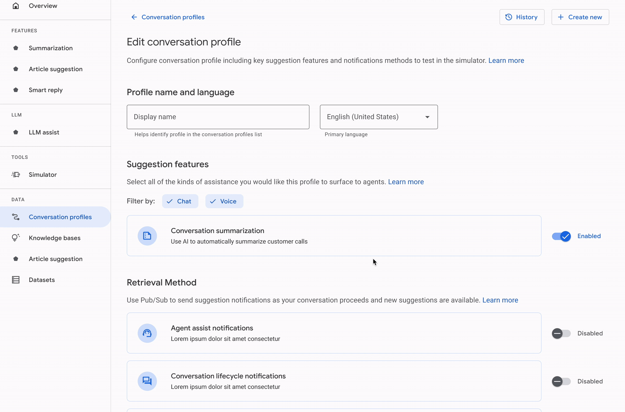
What is a Conversation Profile?
A conversation profile inside the Agent Assist console is essentially a settings panel where the user selects all the specific features they want to enable (configure) to test with their models (i.e. article suggestions, FAQ suggestions, smart reply, smart compose features).

Information Architecture
Mapping the IA of the Agent Assist console helped me determine where Conversation profile falls in the process of uploading datasets and then creating and testing these models in the simulator. This provided context to what prior information the user will know when configuring.
.png)
User Personas
After talking to stakeholders, I was able to identify 3 main user personas to understand who to design for. I prioritized external integration engineers since they represent a baseline for ensuring the console is easy to understand for new unfamiliar users.

EXTERNAL USERS
Solutions Engineers
Small group of technical employees within customer company
Responsible for integrating Agent Assist for their company
INTERNAL USERS

Google Customer Engineers
Help clients with setting up their platform for larger customers
Tasked with integration, more experienced with the product

END USERS
Call Center Agents
Directly use the product during their conversations with clients
Product improves productivity and resolves client issues
Primary Pain Points

Information Overload
Currently when creating and editing a conversational profile, users encounter 9 different suggestion features to individually enable (smart reply, article suggestion, summarization, knowledge search and more).
Each include dropdown menus, sliders, and switches when expanded and some apply to only chat or voice, creating a lengthy and confusing experience for users.

Lack of Version Control
In the process of configuring and testing models, users return to the conversation profile multiple times to experiment with different thresholds and settings. Without version control, monitoring profiles is extremely difficult to do so
Design Goals
To address my critical user needs, I outlined 4 main design goals to achieve.
Feature Discoverability
Consolidate features based on type and modality (chat/ voice) to facilitate enabling features, reduce form length, and improve discoverability
Intuitive Experience
Revisit the overall information architecture and flow of profile configuration in order to ensure an effortless experience for users, minimizing confusion
Simple Integration
Seamlessly integrate LLM assist model selection into the profile configuration features, considering scalability for a multitude of free-form and pre-built future prompts
Convenient Platform
Integrate version control in order to allow users to return to previous profiles, improving convenience when using the platform
Existing Conversation Profile Analysis
Before designing, I broke down the conversation profile page to understand all of the features, inspecting how a lot of the options are repetitive, deprecated or could be consolidated. There was an abundant use of dropdown menus, short line lengths leaving unused space, and inconsistencies with wording tenses and UI components.
.png)


Repetitive options and switches
IA categorization
Deprecated features in diff positions
UI component inconsistencies (dropdown vs chip select for single item select)

Abundant dropdown options & Short line length, unused space

Inconsistencies with wording tenses
2. Conducting User Research
Critical User Journeys
To accurately represent the workflows of users, I outlined 6 critical user journeys for differing roles in the process and paths (considering the ideal happy paths and edge cases such as testing existing features, configuring new prompts, deleting existing models, and missing prompts). These journeys also consider the multiple entry points into the interface.
Happy Paths
Edge Cases

As a data admin, I want to test features such as my custom smart reply model and try knowledge search in a conversation with a customer and must create a conversation profile.
View Full User Journey


As a data admin, I want to edit an existing conversation profile to disable smart reply and smart compose before trying the simulator.
View Full User Journey


.png)
External UI Research (Dribbble, Pinterest)
To understand existing common UI patterns for concisely organizing complex settings panels/ configuration options, I studied several interfaces — exploring concepts including columns/ forms, stepper flows, and tab formats, deriving insights to incorporate in my future designs.

Traditional Setting Pages
(2 Column, form style)
Maintain distinct separations between sections with space or lines for clarity
Two column formats and horizontal stacking is used to organize complicated panels and space


Internal UI (Vertex AI, Makersuite) & Competitor Research (Cresta AI, Amazon Lux)
Looking at internal AI Google platforms, I studied Vertex AI and MakerSuite, inspecting how they display prompt/ model settings and deployment processes using the robust Material Design system. I also inspected AI competitor platforms such as Lux and Cresta with the UX researchers.

Vertex AI
Consistent use of hiding "more advanced" options to ensure the panel is simple
Integrated help text for input fields and used steppers to provide guidance for more complicated forms

3. Design Iterations
Wireframes & Sketches + Pros & Cons Analysis
In the design process, I started by creating wireframes for a myriad of ideas including shelves, dropdowns, tabs, expansion menus, and more, narrowing down designs to 3 main avenues by determining their pros and cons. Click to expand photo below.

Design Guidelines
To evaluate my design concepts, I outlined 5 design guidelines
1
2
3
4
5
Efficiency
(Click time)
How discoverable are the features? Consider time it takes to configure a profile and the number of clicks required.
Scalability
How well will the design accommodate future changes including integrating more LLM assist features and increased prompts?
Screen Territory
How much screen space is occupied by the process?
How condensed is the UI? Does this influence how understandable the interface feels?
Compatability
How well does the design integrate into the existing Agent Assist platform? How well does it align with the existing design system patterns?
Aesthetic Appearance
How friendly and intuitive does the experience look for users? Consider if it is overwhelming at first glance.
Top Design Iterations
Out of 10+ design concepts, I created high fidelity mockups for 3 main design avenues to further evaluate pros and cons shown below.


Top Iteration 1
Pros
Cons
-
Easy to quickly distinguish chat vs voice, improving discoverability
-
Low screen territory since tabs divide features
-
More scalable as features increase
-
Easy to identify if enabled or not
-
Space management, increased white space allows for icon integration
-
Less discoverability/ more clicks required since tab selection
-
Variance from current design
-
Consider if separation by modality is needed
Expandable dropdowns & tabs
Top Iteration 2
Pros
Cons
-
Configuration is easy to understand with a
4 step breakdown -
Less screen content at each step
-
Visual appearance is easy to follow with heavy use of white space
-
Scalable with more features and additional steps
-
Stepper implies a set order for completion
-
Less discoverability for specific features
-
More clicks required and higher completion time with more stages required to complete
-
Strays heavily from the original design
Stepper Form


Top Iteration 3
Pros
Cons
-
Visually appealing with the integration of icons and increased white space with a clear indication of voice vs chat (card design consistent with the overview page of Agent Assist)
-
Less screen territory by taking advantage of horizontal stacking space
-
Better scalability and less screen territory with “see more features” button
-
Less common features are less discoverable and require more clicks to access; this is negative for LLM assist since it should be prioritized
-
Implementation costs: determine if the design aligns with already existing components in the design system
Feature Cards & Shelves

Stakeholder Feedback & Iterations
After 3 rounds of design iterations and weekly stakeholder reviews with my PM, front-end and back-end engineers, and UX researcher, I developed a series of more robust design mockups. I iterated on the following aspects:
-
Methods of indicating feature status, considering accessibility with colored status tags, switches, and chips
-
For the new LLM feature, designed a process of enabling, searching, and filtering models
-
Redesigned the experience for each feature: designed a new summarization process accounting for distinct chat/voice custom models and LLM integration, and knowledge search and smart reply processes
-
Created designs for edge cases (empty/ error states: no LLM assist, invalid prompts, incomplete information)
-
Create designs for brand-new intermediary pages such as view profile and version history, and added save and confirmation modals


4. Final Design
Design Walkthrough
After 7 weeks, I delivered implementation specifications, a series of robust final design mockups with interactive prototypes, and a prototype video to the engineering team. In the following weeks, I worked directly with the tech team during the implementation for the launch.
Prototype Video
Design Experience Breakdown
General IA Reorganization
Information rearranged and space management
New buttons, features, and new intermediary page integration
Consolidation of features and wording consistency
Added functionality: Enable features without expanding, Easily aware of feature status

Feature 1
Summarization Process
Use AI to automatically summarize customer calls at any point during conversations.
-
User can now quickly filter based on chat/ voice specific features and are not immediately overwhelmed with all the options.
-
User can now select different custom model selection for chat/ versus voice, consolidated in one location, improving convenience.
-
Design includes easy integration of new LLM assist model option into summarization

Feature 2
LLM Assist Process
Receive LLM-generated answers based on previously created freeform and prebuilt prompts
-
Design allows for filtering and searching LLM models so users are able to quickly locate and enable prompts
-
Table format is scalable for hundreds of prompts in the future
-
Design reflects invalid prompts and no prompts found using tooltips and banners for warnings


-
Users immediately know feature status and can configure settings easily
-
Users can select virtual agents and models through similar dropdown menus, decide on maximum suggestion limit, and thresholds through sliders
Smart Reply: Surface pre-written suggestions to agents
Knowledge Search: Query uploaded knowledge
bases and receive LLM-generated answers when asked
Sentiment Analysis: Automatically analyze messages to determine emotional intent
Smart Reply, Knowledge
Search, Sentiment Analysis
Feature 3, 4, 5
New Page
Save/ Cancel Confirmation
-
Design includes new modals displaying what changes have been made (new features enabled or models created)
-
User can confirm exactly what they are changing to prevent losing information

%20(1).png)
New Page
View Profile Page
-
Added a new intermediary page (prior to editing profile) to allow for the user to quickly see what models/ features have been enabled in the profile
-
Simple UI so user doesn't need to scroll to see information overview
-
User can also directly access models hyperlinked to sections of the profile
-
Snackbar as entry point to view page

New Page
Version History Pages
-
User can quickly access past versions of the profile and restore history, aiding model experimentation
-
User can sort features by name, editor, and timestamp
-
When an entry is clicked, details about the change is visible
-
Designs experiment with organizing by date as well as by action (feature)

This solution allows human agents to more readily recognize and take advantage of the machine learning components Agent Assist offers, improving the quality and consistency of the customer experience.
Overall Reflection
~ Tight-knit collaboration. Impactful AI projects. Fast turnaround.~
Through this internship, I enjoyed collaborating with a tight-knit team of experienced designers, bouncing ideas off others during brainstorming sessions and design sprints, but also having ownership over my own projects. As the solo designer, I was able to work on time-sensitive projects with a large impact, cross-functionally collaborating directly with front-end engineers and PMs on a weekly cadence to coordinate implementation details for the launch, due to the incredibly fast turnaround in the AI space.
~Prioritizing Users. Complex Enterprise problem space. Creativity vs feasibility~
I appreciate that one of the main values of Google is putting users first, especially with accessibility. Through user research and competitor audits, I was able to solve complex problems considering varied users, especially in the space of enterprise products (a new problem space for me (b2b2c) with many new technical attributes compared to consumer b2c products). For time-sensitive projects, I had realistic constraints for feasibility, but for more exploratory designs, my team welcomed creativity and engaging experiences - even allowing me to draw vector illustrations to complement designs.
~Robust design system. Design process~
I really appreciate how well-integrated and cohesive the Material Design system is across all 271 products- from all the precisely created components including dark mode variants. I participated in design sprints to learn MD3 and was able to use it for my second project alongside MD2 Angular components for the first project. The internship also reinforced the importance of the design process from information architecture breakdowns, critical user journeys, and design iterations to create holistic designs.